Exciting New HubSpot Changes are Coming!
Change doesn’t have to be scary. In fact, it can be fun and helpful! Just like the new HubSpot menu changes coming in May 2024.
HubSpot is rolling out a new user interface for its menu navigation, which will streamline operations for clients. Instead of one top-level menu, there will now be one top menu and a side menu! Overall, you’ll have a smoother experience navigating to your frequently used tabs within HubSpot. While things may be moving around, nothing is being deleted or archived. Everything will still be there and working from its new place. And, if you need help, we’re always here! Here’s a little more information on what you can expect:
The Existing Menu
HubSpot — as we now know and love it — has all of its features in the top bar navigation. The existing (old) version has two rows, and looks something like this:

While this menu convention has worked for quite some time, HubSpot is updating it to help clients find things faster and easier.
The New Menu Experience
Now, there will be two menus: one on the top and one on the left side. Let’s look at new top navigation first.
Top Level Navigation
The new top level navigation will be very similar to one of the existing menus. It will look like this:

So, what do all these new icons mean? Let’s break them down:
- The icon on the very left (also known as a Sprocket) helps you navigate to your default home page.
- The global search bar is used to search your entire HubSpot account for assets, tools, learning resources, and settings.
- The phone icon is the calling tool.
- The market icon houses the HubSpot marketplaces, including the App Marketplace, Template Marketplace, Solutions Directory, and links to your existing connected apps. HubSpot Marketplace providers also have a Marketplace menu where they can access Listings, Provider info, and Transactions.
- The question mark contains HubSpot support resources. Clicking on the help icon makes a panel appear with the support resources available for your account’s subscription.
- The settings icon has all of your account and product settings in one place. Navigate to each of your settings using the left sidebar menu. When clicking Settings while in certain tools, you’ll be brought to that tool’s specific settings.
- The notification bell is a central place for all your user notifications.
- Lastly, the account dropdown menu has access options for account details and services. Here, you can find profile & preferences, your account Hub ID, account & billing, HubSpot Academy, pricing & features, product updates, projects, as well as training & services. You can also sign out and view the privacy policy from this section.
Left Sidebar Menu
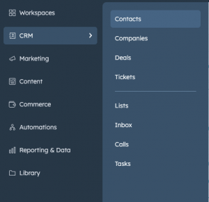
The new left sidebar menu organizes your account’s tools and resources into categories. All you have to do is click a navigation menu item to view the tools in that category, then click the tool to navigate to it. This sidebar will look like this:

As you can see here, the new side menu contains the following items: CRM, Marketing, Content, Commerce, Automation, Reporting & Data, Library. Each of these sections contains additional items. Just click on a navigation item (like CRM, for example), and more options will pop up! Let’s look at these in detail.
- The Workspaces tab contains tools that organize specific daily tasks into one place, including the prospecting and help desk workspaces.
- In the CRM tab, you’ll find home pages and tools related to records, interactions, and payments. This includes contacts, companies, deals, tickets, lists, inbox, calls, and tasks.
- In the Marketing tab, you’ll find tools for marketing content, conversions, and strategy. This includes campaigns, email, social, ads, forms, CTAs, and SMS.
- In the Content tab, you’ll find tools for your web-hosted content. This includes website pages, landing pages, blog, knowledge base, customer portal, SEO, HubDB, and Design Manager.
- In the Commerce tab, you’ll find tools related to commerce. These tabs include quotes, payments, payment links, invoices, products, and subscriptions.
- In the Automations tab, you’ll find tools to automate actions in your HubSpot account. This includes workflows, sequences, chatflows, and feedback surveys.
- In the Reporting & Data tab, you’ll find tools to report your data and to understand and manage the organization of data in your account. This includes dashboards, reports, forecasts, goals, integrations, custom events, the data quality command center, datasets, and the data model explorer.
- The Library tab includes your templates, meeting scheduling pages, files, documents, playbooks, snippets, and coaching playlists.
Need Help with Your New HubSpot Menu Changes?
We know change can be hard. But we truly believe these new HubSpot menu changes will allow our clients to be even more successful. If you’re experiencing any issues with the new HubSpot menu, you can reach out to us.
