Waiting for leads to come rolling in from your website but hearing nothing but crickets? Stir up some action with these CTA best practices.
Have you found yourself asking, “What the heck is a CTA, anyway?” Don’t worry, you’re not alone. Marketing gurus are full of acronyms that sound great until you walk away and realize you really aren’t sure what they really mean — or how you’re going to implement them.
Here’s what you need to know: a call-to-action (CTA) is basically your website’s version of telling a potential customer what you want them to do. They should be everywhere! Each page on your site should be focused on driving your audience to do something. Think of your CTAs as a friendly helping hand showing them the way. Whether it’s to learn more about an aspect of your business or to sign up for updates from your newsletter, a CTA is how you move your readers down the funnel towards becoming a customer.
However — as with everything — not every CTA works. The trick is that they have to grab attention and be enticing. If they fall flat, no one is going to click! What makes the thing you’re offering worth people’s time? How CTAs look and where they’re located also has a huge impact on how people will react. Our CTA best practices will help you identify how you can make your CTAs stand out and start pulling their weight on your website.
These CTA Best Practices will Help You Generate and Nurture Stronger Leads for Your Sales Team
So what exactly goes into creating an eye-catching CTA? First things first, while they have one over-arching definition, there’s several different ways you can use CTAs throughout your site, (and you should be using a lot of them). For one, your leads are going to be at different stages in the sales funnel and are going to want different things. Having several different kinds of CTAs can help ensure that you have a little something for everyone who lands on your site.
Here are three main CTAs you should use:
1. Some of your visitors may be interested in what you have to offer, but it’s going to take a little more to push them to the next step. Having a CTA that generates leads by calling out a piece of gated content where they can learn something from you or receive access to your newsletter is a great way to keep leads engaged and in the funnel. Ask your audience to read or learn more with a lead-generating CTA to get them to move forward. You’ll want to put these in a high traffic area like your blog — as a pop-up, within the content, at the end of the post, or in a sidebar — to be sure that people take notice.
2. Another type of CTA you can use is one that nurtures your leads. These will play to the crowd who are already interested in your product and are ready to learn more. Your enticing offer here might be a demo, webinar, or free trial that will help them get to know the look and feel of your product or service without locking them down into a contract. These could also work in a blog post, but try to stick to ones that are more relevant to your offerings so your content is leading up to the big push. You can also use these on the pages that talk more about what your business does.
3. Last but not least, use CTAs to push leads to your sales team! Push people to your contact page or the direct email to your sales department with a message that makes them want to start a relationship with you. Make sure it’s clear that they’re reaching out about your product or service and be sales focused. These leads are ready to take the plunge and your CTA should show that you’re ready to welcome them. Like the rest, use these in your blog and anywhere else you think a lead ready to become a customer would end up. Having them on your web pages makes it easy for visitors to know exactly how to contact you no matter where they end up.
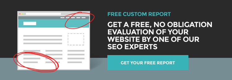
Now that you know a little more about the types of CTAs, lets focus on best practices. The way you write your message has a huge impact on whether or not someone chooses to click, because that’s what is telling them what you want them to do. Your message should be clear and concise, but also punchy. Your visitor should be able to understand exactly what you want them to do and how you say it should make them want to spring into action. Take one from our site for example:

This CTA’s goal is to have site visitors reach out to our team to find out more about the type of solutions we can provide. We make it clear what we can offer with an exciting message, and then provide an easy way to contact our team.
Did you notice the design? This is another major key for following CTA best practices. While your message might be great and your focus is clear, if it doesn’t visually stand out, how can you expect anyone to find it? Great CTAs are a combination of good content and strong design. Don’t be afraid to use a bright or bold color to help yours stand out! Just try not to go overboard, it’s probably never a good idea to stick a giant flashing button on your page. Your CTA should still flow with the overall design of your site — and try not to use any “outdated” fonts.
If your CTA isn’t getting the results that you hoped, don’t give up! One of the most important CTA best practices is to keep testing and trying different things. See what works well with your audience and take advantage of it! You can always change it to something new.