How are you telling visitors to your site what you want them to do? Using different types of CTAs will give your audience a little more direction.
Now that you’ve learned all about great inbound content, how are you going to get people who land on your blog to read more posts or hit different pages on your site?
Calls-to-action or CTAs, jump out at your visitors, whether it’s a colored link or a brightly colored button, and give them a sense of purpose for what you want them to do after they read your content. The best part about using them on your site is that there are different types of CTAs that you can utilize throughout and even on the same page.
Pull up one of the pages on your site and read the content. Now ask yourself: what’s the purpose of this page? What does the page want me to do next? There should be a clear action, a CTA, leading you to your next step. If you have one, is it clear? You want your CTAs to be, in a sense, stupidly simple. This isn’t to say that the people reading your site are stupid, but that it should be so easy to figure out that it feels like a natural and organic course of action.
The way you use different types of CTAs will help elicit this feeling on your site, and encourage people to click through, and keep clicking. CTAs are great with helping you keep people on your website longer. You want people to stay for two main reasons — first, because the longer they’re clicking around and reading about your business and what you offer, the more time you have to lead them down your sales funnel.

Second, more time on your site gives your search ranking a boost. The last thing you want is for people to hit your page and immediately hit the back arrow. This makes Google think that whatever they found wasn’t helpful, and it will push your site lower in search results as a consequence. The more time they’re reading, the more faith Google will have that your site is a reputable source for that keyword, and you’ll start rising higher in the ranks.
When and where should you use CTAs? That depends on the type you want to use. The first thing you need to do is figure out what your goal is for the page. Where do you want to drive visitors to next? If it’s a page talking about your products or services, you might want to try pushing people to your contact form. For your blog, it might be signing up for your email newsletter. In both of these instances, you can use types of CTAs to drive people to more service pages and blog posts on top of your big focus. This way you can catch more people than just those who are ready to convert on your site.
Use These Types of CTAs to Guide Your Leads Right to Your Sales Team
Depending on what you want to call out will decide how flashy of a CTA you’ll need. For linking to another page or blog post, use a text CTA to shoot visitors to their next destination. These don’t need to have a special message just for them, instead they should fit seamlessly within the content you’ve written, but you still at least want to give a heads up for where they’re going.
WORRIED YOUR WEBSITE SUCKS?
Don’t Feel Bad – You Just Have to Do Better. Keep Learning With Us by Reading Our Article on Building a Better Strategy for Your Business’s Website Redesign
For example, if you want to send people to another post about security licenses on a website, you’ll want your link to be a sentence that talks about security licenses so their interest is carried over onto the new page. Don’t go overboard with these, typically a range of three to six links is enough to keep it covered.
Another reason to use text CTAs is the links you use are also beneficial towards the SEO of a page. When search engines crawl your page to see how to rank it, they look for inbound links on a page, and having text CTAs helps continue to boost your site. A good post with text CTAs will look like this — see how the links immediately draw your attention?

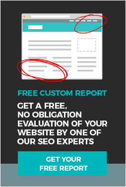
The other type of CTA you should be using on your site is the custom CTA. This is the flashy one that you see all the time with forms and big callouts. You want these to stand out, but not so much that it’s obnoxious. With custom CTAs, there’s a design aspect that matters just as much as the message you’re giving. When you use these, you should be trying to call out to people who are already interested in your product or service and want to learn more. A great custom CTA starts with what you’re offering. You have to make it sound enticing for your audience to feel that it’s worth the click. Need an example? Here’s one from our own site that ties it all together.

Remember what we said about creating blog topics? The customer pain points you learned about can be easily turned into a short message that grabs attention. Maybe your customers face issues with staffing their teams, and you specialize in helping them boost their company culture. Your CTA might be sound something like: Exhausted from constantly dealing with staff turnover? Check out our free guide on how to boost employee engagement.
Your message should grab attention and then give them a reason to click. In our example, you’re offering relief to a pain point with an immediate resource that can help offer insight on how they can do better. Next, you’ll want to design a CTA that pops on the page. Don’t be afraid to use bold colors! Just make sure they fit with your brand standards. You can have this type of CTA appear right within the content, at the end, or in the sidebar. Make it stand out and use a creative message to capture the most attention. If it’s not performing well, change it up! Testing types of CTAs is a great way to learn the habits of your audience and continue to optimize your site.
Like what you’re learning? Keep reading to learn more about how you can make your website even better! Check out the fourth part of our Your Website Sucks! series on using social media here. Want to start from the beginning? Let’s take it from the top.

